
Notice
Recent Posts
Recent Comments
Link
250x250
| 일 | 월 | 화 | 수 | 목 | 금 | 토 |
|---|---|---|---|---|---|---|
| 1 | 2 | 3 | 4 | 5 | 6 | 7 |
| 8 | 9 | 10 | 11 | 12 | 13 | 14 |
| 15 | 16 | 17 | 18 | 19 | 20 | 21 |
| 22 | 23 | 24 | 25 | 26 | 27 | 28 |
Tags
- RNN
- Transformer
- AI Math
- N21
- mrc
- KLUE
- word2vec
- ODQA
- pyTorch
- Data Viz
- AI 경진대회
- N2N
- matplotlib
- Ai
- 데이터 시각화
- GPT
- passage retrieval
- 기아
- Bert
- seaborn
- 딥러닝
- Bart
- 데이터 구축
- nlp
- Optimization
- 현대자동차
- dataset
- 2023 현대차·기아 CTO AI 경진대회
- Attention
- Self-attention
Archives
- Today
- Total
쉬엄쉬엄블로그
(Data Viz) More Tips (+ 실습) 본문
728x90
이 색깔은 주석이라 무시하셔도 됩니다.
More Tips
Grid 이해하기
Default Grid
- 기본적인 Grid는 축과 평행한 선을 사용하여 거리 및 값 정보를 보조적으로 제공
- 색은 다른 표현들을 방해하지 않도록 무채색 (color)
- 항상 Layer 순서상 맨 밑에 오도록 조정 (zorder)
- 큰 격자/세부 격자 (which=’major’, ‘minor’, ‘both’)
- X축? Y축? 동시에 (axis=’X’, ‘Y’, ‘both’)
다양한 타입의 Grid
- 전형적인 Grid는 아니지만 여러 형태의 Grid가 존재
- 두 변수의 합이 중요하다면 x+y = c
- 비율이 중요하다면 y = cx
- 두 변수의 곱이 중요하다면 xy = c
- 특정 데이터를 중심으로 보고 싶다면 (x-x’)^2 + (y-y’)^2 = c
- 동심원을 사용
- 전형적이지 않고, 구현도 까다롭지만
- numpy + matplotlib으로 쉽게 구현 가능
- 재미있는 예시는 https://medium.com/nightinagle/gotta-gridem-all-2f768048f934
심플한 처리
선 추가하기
면 추가하기

Setting 바꾸기
Theme
- 대표적으로 많이 사용하는 테마
실습
import numpy as np
import matplotlib as mpl
import matplotlib.pyplot as plt
1. Grid
1-1. grid
which: major ticks, minor ticksaxis: x, ylinestylelinewidthzorder
fig, ax = plt.subplots()
ax.grid()
plt.show()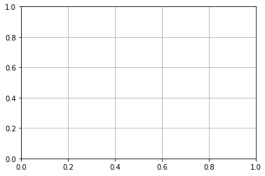
np.random.seed(970725)

x = np.random.rand(20)
y = np.random.rand(20)


fig = plt.figure(figsize=(16, 7))
ax = fig.add_subplot(1, 1, 1, aspect=1)


ax.scatter(x, y, s=150,
           c='#1ABDE9',
           linewidth=1.5,
           edgecolor='black', zorder=10)


ax.set_xticks(np.linspace(0, 1.1, 12, endpoint=True), minor=True)

ax.set_xlim(0, 1.1)
ax.set_ylim(0, 1.1)


ax.grid(zorder=0, linestyle='--', which='both', axis='both', linewidth=2)
ax.set_title(f"Default Grid", fontsize=15,va= 'center', fontweight='semibold')

plt.tight_layout()
plt.show()
1-2. x + y = c
그리드 변경은 grid 속성을 변경하는 방법도 존재하지만 간단한 수식을 사용하면 쉽게 그릴 수 있다.
fig = plt.figure(figsize=(16, 7))
ax = fig.add_subplot(1, 1, 1, aspect=1)


ax.scatter(x, y, s=150,
           c=['#1ABDE9' if xx+yy < 1.0 else 'darkgray' for xx, yy in zip(x, y)],
           linewidth=1.5,
           edgecolor='black', zorder=10)

## Grid Part
x_start = np.linspace(0, 2.2, 12, endpoint=True)

for xs in x_start:
    ax.plot([xs, 0], [0, xs], linestyle='--', color='gray', alpha=0.5, linewidth=1)


ax.set_xlim(0, 1.1)
ax.set_ylim(0, 1.1)

ax.set_title(r"Grid ($x+y=c$)", fontsize=15,va= 'center', fontweight='semibold')

plt.tight_layout()
plt.show()
1-3. y = cx
fig = plt.figure(figsize=(16, 7))
ax = fig.add_subplot(1, 1, 1, aspect=1)


ax.scatter(x, y, s=150,
           c=['#1ABDE9' if yy/xx >= 1.0 else 'darkgray' for xx, yy in zip(x, y)],
           linewidth=1.5,
           edgecolor='black', zorder=10)

## Grid Part
radian = np.linspace(0, np.pi/2, 11, endpoint=True)

for rad in radian:
    ax.plot([0,2], [0, 2*np.tan(rad)], linestyle='--', color='gray', alpha=0.5, linewidth=1)


ax.set_xlim(0, 1.1)
ax.set_ylim(0, 1.1)

ax.set_title(r"Grid ($y=cx$)", fontsize=15,va= 'center', fontweight='semibold')

plt.tight_layout()
plt.show()
1-4. 동심원
fig = plt.figure(figsize=(16, 7))
ax = fig.add_subplot(1, 1, 1, aspect=1)


ax.scatter(x, y, s=150,
           c=['darkgray' if i!=2 else '#1ABDE9'  for i in range(20)] ,
           linewidth=1.5,
           edgecolor='black', zorder=10)

## Grid Part
rs = np.linspace(0.1, 0.8, 8, endpoint=True) # 0.1 : 반지름

for r in rs:
    xx = r*np.cos(np.linspace(0, 2*np.pi, 100))
    yy = r*np.sin(np.linspace(0, 2*np.pi, 100))
    ax.plot(xx+x[2], yy+y[2], linestyle='--', color='gray', alpha=0.5, linewidth=1)

    ax.text(x[2]+r*np.cos(np.pi/4), y[2]-r*np.sin(np.pi/4), f'{r:.1}', color='gray')

ax.set_xlim(0, 1.1)
ax.set_ylim(0, 1.1)

ax.set_title(r"Grid ($(x-x')^2+(y-y')^2=c$)", fontsize=15,va= 'center', fontweight='semibold')

plt.tight_layout()
plt.show()
2. Line & Span
import pandas as pd

student = pd.read_csv('./StudentsPerformance.csv')
student.head()
2-1. Line
axvline()axhline()
직교좌표계에서 평행선을 원하는 부분에 그릴 수도 있다.
선은 Plot으로 그리는게 더 편할 수 있기에 원하는 방식으로 그려주면 된다.
fig, ax = plt.subplots()

ax.set_aspect(1)
ax.axvline(0, color='red')
ax.axhline(0, color='green')

ax.set_xlim(-1, 1)
ax.set_ylim(-1, 1)

plt.show()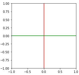
ax의 전체 구간을 0,1로 삼아 특정 부분에만 선을 그릴 수도 있다.
다만 다음과 같이 특정 부분을 선으로 할 때는 오히려 plot이 좋다.
fig, ax = plt.subplots()

ax.set_aspect(1)
ax.axvline(0, ymin=0.3, ymax=0.7, color='red')

ax.set_xlim(-1, 1)
ax.set_ylim(-1, 1)

plt.show()
fig, ax = plt.subplots(figsize=(10, 10))
ax.set_aspect(1)

math_mean = student['math score'].mean()
reading_mean = student['reading score'].mean()

ax.axvline(math_mean, color='gray', linestyle='--')
ax.axhline(reading_mean, color='gray', linestyle='--')

ax.scatter(x=student['math score'], y=student['reading score'],
           alpha=0.5,
           color=['royalblue' if m>math_mean and r>reading_mean else 'gray'  for m, r in zip(student['math score'], student['reading score'])],
           zorder=10,
          )

ax.set_xlabel('Math')
ax.set_ylabel('Reading')

ax.set_xlim(-3, 103)
ax.set_ylim(-3, 103)
plt.show()
2-2. Span
axvspan()axhspan()
선과 함께 다음과 같이 특정 부분 면적을 표시할 수 있다.
fig, ax = plt.subplots()

ax.set_aspect(1)
ax.axvspan(0,0.5, color='red')
ax.axhspan(0,0.5, color='green')

ax.set_xlim(-1, 1)
ax.set_ylim(-1, 1)

plt.show()
fig, ax = plt.subplots()

ax.set_aspect(1)
ax.axvspan(0,0.5, ymin=0.3, ymax=0.7, color='red')

ax.set_xlim(-1, 1)
ax.set_ylim(-1, 1)

plt.show()
특정 부분을 강조할 수도 있지만, 오히려 특정 부분의 주의를 없앨 수도 있다.
fig, ax = plt.subplots(figsize=(8, 8))
ax.set_aspect(1)

math_mean = student['math score'].mean()
reading_mean = student['reading score'].mean()

ax.axvspan(-3, math_mean, color='gray', linestyle='--', zorder=0, alpha=0.3)
ax.axhspan(-3, reading_mean, color='gray', linestyle='--', zorder=0, alpha=0.3)

ax.scatter(x=student['math score'], y=student['reading score'],
           alpha=0.4, s=20,
           color=['royalblue' if m>math_mean and r>reading_mean else 'gray'  for m, r in zip(student['math score'], student['reading score'])],
           zorder=10,
          )

ax.set_xlabel('Math')
ax.set_ylabel('Reading')

ax.set_xlim(-3, 103)
ax.set_ylim(-3, 103)
plt.show()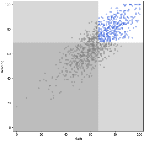
2-3. Spines
ax.spines: 많은 요소가 있지만 대표적인 3가지만set\_visible()set\_linewidth()set\_position()
fig = plt.figure(figsize=(12, 6))

_ = fig.add_subplot(1,2,1)
ax = fig.add_subplot(1,2,2)
ax.spines['top'].set_visible(False)
ax.spines['right'].set_visible(False)
ax.spines['left'].set_linewidth(1.5)
ax.spines['bottom'].set_linewidth(1.5)
plt.show()
fig = plt.figure(figsize=(12, 6))

_ = fig.add_subplot(1,2,1)
ax = fig.add_subplot(1,2,2)
ax.spines['top'].set_visible(False)
ax.spines['right'].set_visible(False)

ax.spines['left'].set_position('center')
ax.spines['bottom'].set_position('center')
plt.show()
축은 중심 외에도 원하는 부분으로 옮길 수 있다.
center-> (axes, 0.5)zero-> (data, 0.0)
fig = plt.figure(figsize=(12, 6))

ax1 = fig.add_subplot(1,2,1)
ax2 = fig.add_subplot(1,2,2)

for ax in [ax1, ax2]:
    ax.spines['top'].set_visible(False)
    ax.spines['right'].set_visible(False)

ax1.spines['left'].set_position('center')
ax1.spines['bottom'].set_position('center')

ax2.spines['left'].set_position(('data', 0.3))
ax2.spines['bottom'].set_position(('axes', 0.2))

ax2.set_ylim(-1, 1)
plt.show()
fig = plt.figure(figsize=(12, 9))

ax = fig.add_subplot(aspect=1)

x = np.linspace(-np.pi, np.pi, 1000)
y = np.sin(x)

ax.plot(x, y)

ax.set_xlim(-np.pi, np.pi)
ax.set_ylim(-1.2, 1.2)

ax.set_xticks([-np.pi, -np.pi/2, 0, np.pi/2, np.pi])
ax.set_xticklabels([r'$\pi$', r'-$-\frac{\pi}{2}$', r'$0$', r'$\frac{\pi}{2}$', r'$\pi$'],)

ax.spines['top'].set_visible(False)
ax.spines['right'].set_visible(False)

ax.spines['left'].set_position('center')
ax.spines['bottom'].set_position('center')
plt.show()
3. Settings
3-1. mpl.rc
plt.rcParams['lines.linewidth'] = 2
plt.rcParams['lines.linestyle'] = ':'
# mpl.rcParams['lines.linewidth'] = 2
# mpl.rcParams['lines.linestyle'] = ':'

# plt.rcParams['figure.dpi'] = 150

plt.rc('lines', linewidth=2, linestyle=':')
# mpl.rc('lines', linewidth=2, linestyle=':')

plt.rcParams.update(plt.rcParamsDefault)    # 설정 초기화
3-2. theme
print(mpl.style.available)

mpl.style.use('seaborn')
# mpl.style.use('./CUSTOM.mplstyle') # 커스텀을 사용하고 싶다면

plt.plot([1, 2, 3])

'''
['Solarize_Light2', '_classic_test_patch', 'bmh', 'classic', 'dark_background', 'fast', 'fivethirtyeight', 'ggplot', 'grayscale', 'seaborn', 'seaborn-bright', 'seaborn-colorblind', 'seaborn-dark', 'seaborn-dark-palette', 'seaborn-darkgrid', 'seaborn-deep', 'seaborn-muted', 'seaborn-notebook', 'seaborn-paper', 'seaborn-pastel', 'seaborn-poster', 'seaborn-talk', 'seaborn-ticks', 'seaborn-white', 'seaborn-whitegrid', 'tableau-colorblind10']
'''
with plt.style.context('fivethirtyeight'):  # 현재 plot에 대해서만 스타일을 적용
    plt.plot(np.sin(np.linspace(0, 2 * np.pi)))
plt.show()
plt.plot(np.sin(np.linspace(0, 2 * np.pi)))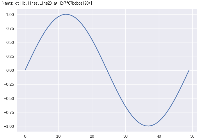
출처: 부스트캠프 AI Tech 4기(NAVER Connect Foundation)
'부스트캠프 AI Tech 4기' 카테고리의 다른 글
| (NLP) Word Embedding (0) | 2023.06.19 |
|---|---|
| (NLP) Intro to NLP (0) | 2023.06.17 |
| (Data Viz) Facet (+ 실습) (0) | 2023.06.15 |
| (Data Viz) Color (+ 실습) (0) | 2023.06.14 |
| (Data Viz) Text (+ 실습) (0) | 2023.06.13 |
'부스트캠프 AI Tech 4기' Related Articles
more


Comments