
Notice
Recent Posts
Recent Comments
Link
250x250
| 일 | 월 | 화 | 수 | 목 | 금 | 토 |
|---|---|---|---|---|---|---|
| 1 | 2 | 3 | 4 | 5 | 6 | 7 |
| 8 | 9 | 10 | 11 | 12 | 13 | 14 |
| 15 | 16 | 17 | 18 | 19 | 20 | 21 |
| 22 | 23 | 24 | 25 | 26 | 27 | 28 |
Tags
- 데이터 시각화
- Transformer
- GPT
- Bart
- seaborn
- Attention
- Ai
- AI Math
- word2vec
- AI 경진대회
- mrc
- pyTorch
- ODQA
- KLUE
- RNN
- dataset
- Self-attention
- 기아
- Data Viz
- matplotlib
- 2023 현대차·기아 CTO AI 경진대회
- passage retrieval
- 딥러닝
- Optimization
- nlp
- 현대자동차
- Bert
- N2N
- 데이터 구축
- N21
Archives
- Today
- Total
쉬엄쉬엄블로그
(Data Viz) Color (+ 실습) 본문
728x90
이 색깔은 주석이라 무시하셔도 됩니다.
Color 사용하기
Color에 대한 이해
색이 중요한 이유
- 위치와 색은 가장 효과적인 채널 구분
- 위치는 시각화 방법에 따라 결정되고
- 색은 우리가 직접적으로 골라야 한다.
- 사람이 공통적으로 색이 가지는 느낌은 다르다.
- 그리고 좋은 색과 색 배치는 예쁘다.
화려함이 시각화의 전부는 아니다!

- 심미적으로 화려한 것은 분명 매력적
- 하지만 화려함은 시각화의 일부 요소
- 가장 중요한 것은 독자에게 원하는 인사이트를 전달
- 전하고 싶은 내용을 모두 전달했는가 + 그 과정에서 오해는 없었는가
색이 가지는 의미
- 우리는 살면서 이미 많은 색을 사용했다.
- 높은 온도에는 파랑, 낮은 온도에는 빨강이라면?
- 카카오가 초록색, 네이버가 노란색이라면?
- 기존 정보와 느낌을 잘 활용하는 것이 중요
- 만약 본인이 정말 감이 없다면?
- 다른 사례 스터디를 통해 색상 선택
- 이미 사용하느 색에는 이유가 있다.
Color Palette의 종류
범주형(Categorical)
- Discrete, Qualitative 등 다양한 이름으로 불림
- 독립된 색상으로 구성되어 범주형 변수에 사용
- 최대 10개의 색상까지 사용
- 그 외에는 기타로 묶을 것
- 색의 차이로 구분하는 것이 특징
- 채도, 명도를 개별적 조정은 지양
연속형(Sequential)
- 정렬된 값을 가지는 순서형, 연속형 변수에 적합
- 연속적인 색상을 사용하여 값을 표현
- 어두운 배경에서는 밝은 색이,
- 밝은 배경에서는 어두운 색이 큰 값을 표현
- 색상은 단일 색조로 표현하는 것이 좋고,
- 균일한 색상 변화가 중요
발산형(Diverge)
- 연속형과 유사하지만 중앙을 기준으로 발산
- 상반된 값(ex. 기온)이나,
- 서로 다른 2개(ex. 지지율)을 표현하는데 적합
- 양 끝으로 갈수록 색이 진해지며
- 중앙의 색은 양 쪽의 점에서 편향되지 않아야 함
- 꼭 무채색일 필요는 없음
그 외 색 Tips
강조, 그리고 색상 대비
- 데이터에서 다름을 보이기 위해 Highlighting 가능
- 강조를 위한 방법 중 하나. 색상 대비(Color Contrast) 사용
- 명도 대비 : 밝은 색과 어두운 색을 배치하면 밝은 색은 더 밝게, 어두운 색은 더 어둡게 보임 (회색 - 검정)
- 색상 대비 : 가까운 색은 차이가 더 크게 보임. (파랑 - 보라, 빨강 - 보라)
- 채도 대비 : 채도의 차이. 채도가 더 높아보임 (회색 - 주황)
- 보색 대비 : 정반대 색상을 사용하면 더 선명해 보인다. (빨강 - 초록)
색각 이상
- 삼원색 중에 특정 색을 감지 못하면 색맹
- 부분적 인지 이상이 있다면 색약
- 색 인지가 중요한 분야(과학/연구 등)에 있어서는 이에 대한 고려가 필수
0. 색상 이해하기
색을 이해하기 위해서는 rgb보다 hsl을 이해하는 것이 중요하다.
- Hue(색조) : 빨강, 파랑, 초록 등 색상으로 생각하는 부분
- 빨강에서 보라색까지 있는 스펙트럼에서 0-360으로 표현
- Saturate(채도) : 무채색과의 차이
- 선명도라고 볼 수 있음 (선명하다와 탁하다.)
- Lightness(광도) : 색상의 밝기

참고
- Github Topic Color-palette
- karthik/wesanderson
- Top R Color Palettes to Know for Great Data Visualization
!pip install matplotlib==3.3.2


import numpy as np
import pandas as pd
import matplotlib as mpl
import matplotlib.pyplot as plt
1. 범주형 색상 (Qualitative)
student = pd.read_csv('./StudentsPerformance.csv')
student.head()
1-1. 색 살펴보기
matplotlib의 colormap 다루기
# Group to Number
groups = sorted(student['race/ethnicity'].unique())
gton = dict(zip(groups , range(5)))

# Group에 따라 색 1, 2, 3, 4, 5
student['color'] = student['race/ethnicity'].map(gton)

# color list to color map
print(plt.cm.get_cmap('tab10').colors)


```
((0.12156862745098039, 0.4666666666666667, 0.7058823529411765), (1.0, 0.4980392156862745, 0.054901960784313725), (0.17254901960784313, 0.6274509803921569, 0.17254901960784313), (0.8392156862745098, 0.15294117647058825, 0.1568627450980392), (0.5803921568627451, 0.403921568627451, 0.7411764705882353), (0.5490196078431373, 0.33725490196078434, 0.29411764705882354), (0.8901960784313725, 0.4666666666666667, 0.7607843137254902), (0.4980392156862745, 0.4980392156862745, 0.4980392156862745), (0.7372549019607844, 0.7411764705882353, 0.13333333333333333), (0.09019607843137255, 0.7450980392156863, 0.8117647058823529))
```
범주형 색상은 채도와 광도는 거의 일정하고, 색상의 변화만으로 차이를 주는 것이 특징이다.
from matplotlib.colors import ListedColormap

qualitative_cm_list = ['Pastel1', 'Pastel2', 'Accent', 'Dark2', 'Set1', 'Set2', 'Set3', 'tab10']

fig, axes = plt.subplots(2, 4, figsize=(20, 8))
axes = axes.flatten()

student_sub = student.sample(100)

for idx, cm in enumerate(qualitative_cm_list):
    pcm = axes[idx].scatter(student_sub['math score'], student_sub['reading score'],
                     c=student_sub['color'], cmap=ListedColormap(plt.cm.get_cmap(cm).colors[:5])
                     )
    cbar = fig.colorbar(pcm, ax=axes[idx], ticks=range(5))
    cbar.ax.set_yticklabels(groups)
    axes[idx].set_title(cm)

plt.show()
일반적으로 tab10과 Set2가 가장 많이 사용되고 더 많은 색은 위에서 언급한 R colormap을 사용하면 좋다.
2. 연속형 색상
- Heatmap, Contour Plot
- 지리지도 데이터, 계층형 데이터에도 적합
2-1. 색 살펴보기
색조는 유지하되 색의 밝기를 조정하여 연속적인 표현을 나타낸다.
sequential_cm_list = ['Greys', 'Purples', 'Blues', 'Greens', 'Oranges', 'Reds',
            'YlOrBr', 'YlOrRd', 'OrRd', 'PuRd', 'RdPu', 'BuPu',
            'GnBu', 'PuBu', 'YlGnBu', 'PuBuGn', 'BuGn', 'YlGn']

fig, axes = plt.subplots(3, 6, figsize=(25, 10))
axes = axes.flatten()

student_sub = student.sample(100)

for idx, cm in enumerate(sequential_cm_list):
    pcm = axes[idx].scatter(student['math score'], student['reading score'],
                            c=student['reading score'],
                            cmap=cm,
                            vmin=0, vmax=100

                     )
    fig.colorbar(pcm, ax=axes[idx])
    axes[idx].set_title(cm)

plt.show()
2-2. imshow
im = np.arange(100).reshape(10, 10)
fig, ax = plt.subplots(figsize=(10, 10))
ax.imshow(im)
plt.show()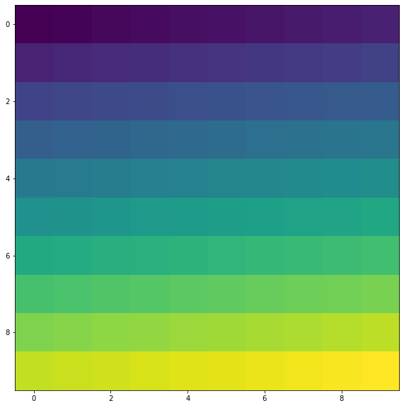
깃헙 잔디밭 만들기 예시
im =  np.random.randint(10, size=(7, 52))
fig, ax = plt.subplots(figsize=(20, 5))
ax.imshow(im, cmap='Greens')
ax.set_yticks(np.arange(7)+0.5, minor=True)
ax.set_xticks(np.arange(52)+0.5, minor=True)
ax.grid(which='minor', color="w", linestyle='-', linewidth=3)
plt.show()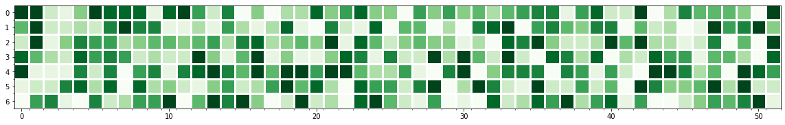
3. 발산형 색상
- 어디를 중심으로 삼을 것인가
- 상관관계 등
- Geospatial
3-1. 색 살펴보기
from matplotlib.colors import TwoSlopeNorm

diverging_cm_list = ['PiYG', 'PRGn', 'BrBG', 'PuOr', 'RdGy', 'RdBu',
            'RdYlBu', 'RdYlGn', 'Spectral', 'coolwarm', 'bwr', 'seismic']

fig, axes = plt.subplots(3, 4, figsize=(20, 15))    # subplots의 결과로 axes가 numpy의 ndarray 형태로 저장됨
axes = axes.flatten()

offset = TwoSlopeNorm(vmin=0, vcenter=student['reading score'].mean(), vmax=100)

student_sub = student.sample(100)

for idx, cm in enumerate(diverging_cm_list):
    pcm = axes[idx].scatter(student['math score'], student['reading score'],
                            c=offset(student['math score']),
                            cmap=cm,
                     )
    cbar = fig.colorbar(pcm, ax=axes[idx],
                        ticks=[0, 0.5, 1],
                        orientation='horizontal'
                       )
    cbar.ax.set_xticklabels([0, student['math score'].mean(), 100])
    axes[idx].set_title(cm)

plt.show()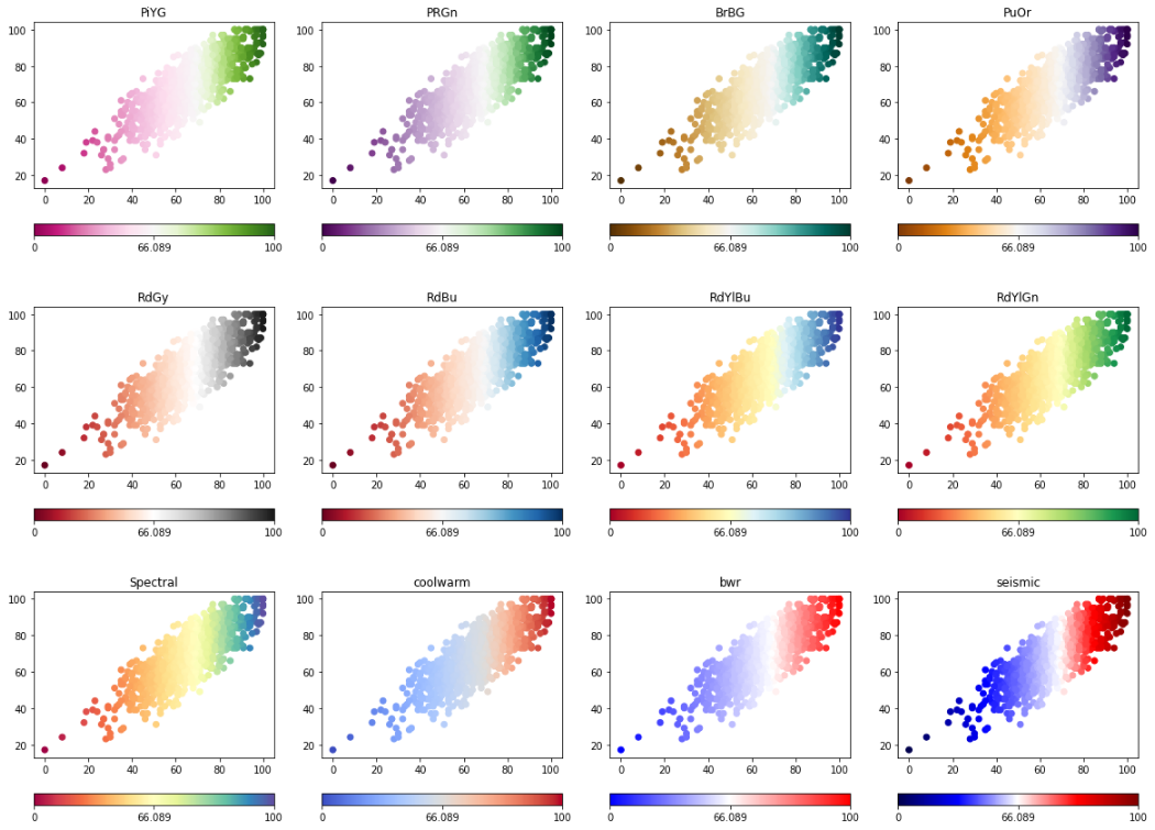
4. 색상 대비 더 이해하기
4-0. 특정 부분 강조를 위한 시각화
fig = plt.figure(figsize=(18, 15))
groups = student['race/ethnicity'].value_counts().sort_index()

ax_bar = fig.add_subplot(2, 1, 1)
ax_bar.bar(groups.index, groups, width=0.5)

ax_s1 = fig.add_subplot(2, 3, 4)
ax_s2 = fig.add_subplot(2, 3, 5)
ax_s3 = fig.add_subplot(2, 3, 6)

ax_s1.scatter(student['math score'], student['reading score'])
ax_s2.scatter(student['math score'], student['writing score'])
ax_s3.scatter(student['writing score'], student['reading score'])

for ax in [ax_s1, ax_s2, ax_s3]:
    ax.set_xlim(-2, 105)
    ax.set_ylim(-2, 105)

plt.show()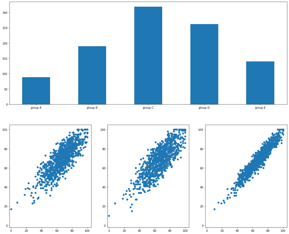
4-1. 명도 대비
a_color, nota_color = 'black', 'lightgray'

colors = student['race/ethnicity'].apply(lambda x : a_color if x =='group A' else nota_color)
color_bars = [a_color] + [nota_color]*4

fig = plt.figure(figsize=(18, 15))
groups = student['race/ethnicity'].value_counts().sort_index()

ax_bar = fig.add_subplot(2, 1, 1)
ax_bar.bar(groups.index, groups, color=color_bars, width=0.5)

ax_s1 = fig.add_subplot(2, 3, 4)
ax_s2 = fig.add_subplot(2, 3, 5)
ax_s3 = fig.add_subplot(2, 3, 6)

ax_s1.scatter(student['math score'], student['reading score'], color=colors, alpha=0.5)
ax_s2.scatter(student['math score'], student['writing score'], color=colors, alpha=0.5)
ax_s3.scatter(student['writing score'], student['reading score'], color=colors, alpha=0.5)

for ax in [ax_s1, ax_s2, ax_s3]:
    ax.set_xlim(-2, 105)
    ax.set_ylim(-2, 105)

plt.show()
4-2. 채도 대비
a_color, nota_color = 'orange', 'lightgray'

colors = student['race/ethnicity'].apply(lambda x : a_color if x =='group A' else nota_color)
color_bars = [a_color] + [nota_color]*4

fig = plt.figure(figsize=(18, 15))
groups = student['race/ethnicity'].value_counts().sort_index()

ax_bar = fig.add_subplot(2, 1, 1)
ax_bar.bar(groups.index, groups, color=color_bars, width=0.5)

ax_s1 = fig.add_subplot(2, 3, 4)
ax_s2 = fig.add_subplot(2, 3, 5)
ax_s3 = fig.add_subplot(2, 3, 6)

ax_s1.scatter(student['math score'], student['reading score'], color=colors, alpha=0.3)
ax_s2.scatter(student['math score'], student['writing score'], color=colors, alpha=0.3)
ax_s3.scatter(student['writing score'], student['reading score'], color=colors, alpha=0.3)

for ax in [ax_s1, ax_s2, ax_s3]:
    ax.set_xlim(-2, 105)
    ax.set_ylim(-2, 105)

plt.show()
4-3. 보색 대비
a_color, nota_color = 'tomato', 'lightgreen'

colors = student['race/ethnicity'].apply(lambda x : a_color if x =='group A' else nota_color)
color_bars = [a_color] + [nota_color]*4

fig = plt.figure(figsize=(18, 15))
groups = student['race/ethnicity'].value_counts().sort_index()

ax_bar = fig.add_subplot(2, 1, 1)
ax_bar.bar(groups.index, groups, color=color_bars, width=0.5)

ax_s1 = fig.add_subplot(2, 3, 4)
ax_s2 = fig.add_subplot(2, 3, 5)
ax_s3 = fig.add_subplot(2, 3, 6)

ax_s1.scatter(student['math score'], student['reading score'], color=colors, alpha=0.3)
ax_s2.scatter(student['math score'], student['writing score'], color=colors, alpha=0.3)
ax_s3.scatter(student['writing score'], student['reading score'], color=colors, alpha=0.3)

for ax in [ax_s1, ax_s2, ax_s3]:
    ax.set_xlim(-2, 105)
    ax.set_ylim(-2, 105)

plt.show()
출처: 부스트캠프 AI Tech 4기(NAVER Connect Foundation)
'부스트캠프 AI Tech 4기' 카테고리의 다른 글
| (Data Viz) More Tips (+ 실습) (2) | 2023.06.16 |
|---|---|
| (Data Viz) Facet (+ 실습) (0) | 2023.06.15 |
| (Data Viz) Text (+ 실습) (0) | 2023.06.13 |
| (Data Viz) Scatter Plot 실습 (0) | 2023.06.12 |
| (Data Viz) Scatter Plot (0) | 2023.06.12 |
'부스트캠프 AI Tech 4기' Related Articles
more


Comments