
| 일 | 월 | 화 | 수 | 목 | 금 | 토 |
|---|---|---|---|---|---|---|
| 1 | 2 | 3 | 4 | 5 | 6 | 7 |
| 8 | 9 | 10 | 11 | 12 | 13 | 14 |
| 15 | 16 | 17 | 18 | 19 | 20 | 21 |
| 22 | 23 | 24 | 25 | 26 | 27 | 28 |
- GPT
- ODQA
- KLUE
- 딥러닝
- nlp
- 데이터 시각화
- Bart
- AI Math
- N21
- 2023 현대차·기아 CTO AI 경진대회
- passage retrieval
- Transformer
- 데이터 구축
- dataset
- Data Viz
- 기아
- N2N
- 현대자동차
- word2vec
- Ai
- RNN
- Bert
- pyTorch
- matplotlib
- seaborn
- AI 경진대회
- Optimization
- Self-attention
- mrc
- Attention
- Today
- Total
쉬엄쉬엄블로그
(Data Viz) Seaborn 기초 실습 - 2 (Categorical API) 본문
이 색깔은 주석이라 무시하셔도 됩니다.
Seaborn 기초 실습
기본적인 분류 5가지의 기본적인 종류의 통계 시각화와 형태 살펴보기
- Categorical API
- Distribution API
- Relational API
- Regression API
- Matrix API
라이브러리와 데이터셋 호출
import numpy as np
import pandas as pd
import matplotlib as mpl
import matplotlib.pyplot as plt
import seaborn as sns

print('seaborn version : ', sns.__version__)

"""
seaborn version :  0.11.2
"""
student = pd.read_csv('./StudentsPerformance.csv')
student.head()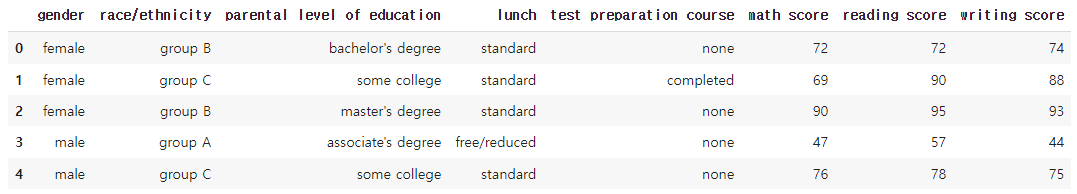
2. Categorical API
count- missing value
데이터가 정규분포에 가깝다면 평균과 표준 편차를 살피는 게 의미가 될 수 있다.
mean(평균)std(표준 편차)
하지만 데이터가 정규분포에 가깝지 않다면 다른 방식으로 대푯값을 뽑는 게 더 좋을 수 있다.
예시로 직원 월급 평균에서 임원급 월급은 빼야 하듯?
분위수란 자료의 크기 순서에 따른 위치값으로 백분위값으로 표기하는 게 일반적이다.
- 사분위수 : 데이터를 4등분한 관측값
min25%(lower quartile)50%(median)75%(upper quartile)max
student.describe()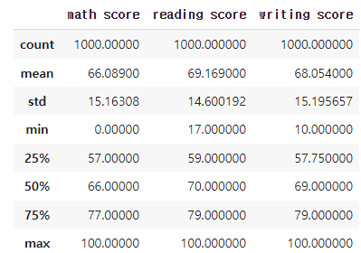
2-1. Box Plot
분포를 살피는 대표적인 시각화 방법으로 Box plot이 있다.
중간의 사각형은 25%, medium, 50% 값을 의미한다.
fig, ax = plt.subplots(1,1, figsize=(12, 5))
sns.boxplot(x='math score', data=student, ax=ax)
plt.show()
추가적으로 Boxplot을 이해하기 위해서는 IQR을 알아야 한다.
- interquartile range (IQR): 25th to the 75th percentile.
그리고 Boxplot에서 outlier은 다음과 같이 표현하고 있다.
- whisker : 박스 외부의 범위를 나타내는 선
- outlier : -IQR1.5과 +IQR1.5을 벗어나는 값
그래서 왼쪽과 오른쪽 막대는 +-IQR * 1.5 범위를, 점들은 Outlier를 의미한다. 하지만 whisker의 길이는 같지 않다.
이는 실제 데이터의 위치를 반영하여 이상치를 시각화하기 위해 자동으로 길이가 조정되기 때문이다.
(데이터의 분포와 이상치의 유무에 따라 길이가 달라짐, whisker와 멀리 떨어진 점일수록 분포의 범위를 크게 벗어나는 값(Outlier)이라는 뜻)
- min : -IQR * 1.5 보다 크거나 같은 값들 중 최솟값
- max : +IQR * 1.5 보다 작거나 같은 값들 중 최댓값
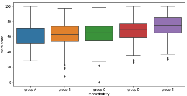
마찬가지로 분포를 다음과 같이 특정 key에 따라 살펴볼 수도 있다.
fig, ax = plt.subplots(1,1, figsize=(10, 5))

sns.boxplot(x='race/ethnicity', y='math score', data=student,
            hue='gender',
            order=sorted(student['race/ethnicity'].unique()),
            ax=ax)

plt.show()
다음 요소를 사용하여 시각화를 커스텀할 수 있다.
widthlinewidthfliersize
fig, ax = plt.subplots(1,1, figsize=(10, 5))

sns.boxplot(x='race/ethnicity', y='math score', data=student,
            hue='gender',
            order=sorted(student['race/ethnicity'].unique()),
            width=0.3,
            linewidth=2,
            fliersize=10,
            ax=ax)

plt.show()
2-2. Violin Plot
box plot은 대푯값을 잘 보여주지만 실제 분포를 표현하기에는 부족하다.
이런 분포에 대한 정보를 더 제공해 주기에 적합한 방식 중 하나가 Violinplot이다.
이번에는 흰점이 50%를 중간 검정 막대가 IQR 범위를 의미한다.
fig, ax = plt.subplots(1,1, figsize=(12, 5))
sns.violinplot(x='math score', data=student, ax=ax)
plt.show()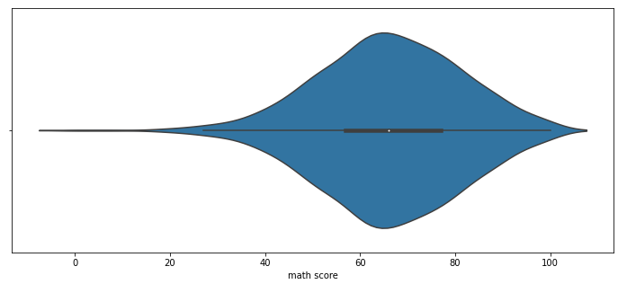
violin plot은 오해가 생기기 충분한 분포 표현 방식이다.
- 데이터는 연속적이지 않습니다. (kernel density estimate를 사용한다.)
- 또한 연속적 표현에서 생기는 데이터의 손실과 오차가 존재한다.
- 데이터의 범위가 없는 데이터까지 표시된다.
이런 오해를 줄이고 정보량을 높이는 방법은 다음과 같은 방법이 있다.
bw(bandwidth) : 분포 표현을 얼마나 자세하게 보여줄 것인가?- ‘scott’, ‘silverman’, float
cut: 끝부분을 얼마나 자를 것인가?- float
inner: 내부를 어떻게 표현할 것인가- “box”, “quartile”, “point”, “stick”, None
fig, ax = plt.subplots(1,1, figsize=(12, 5))
sns.violinplot(x='math score', data=student, ax=ax,
               bw=0.1,
               cut=0,
               inner='quartile'
              )
plt.show()
이제 hue를 사용하여 다양한 분포를 살펴보자.
fig, ax = plt.subplots(1,1, figsize=(12, 7))
sns.violinplot(x='race/ethnicity', y='math score', data=student, ax=ax,
               hue='gender', order=sorted(student['race/ethnicity'].unique())
              )
plt.show()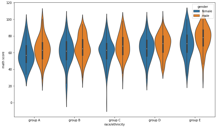
여기서도 적합한 비교를 위해 다양한 변수를 조정할 수 있다.
scale: 각 바이올린의 종류- “area”, “count”, “width”
split: 동시에 비교
fig, ax = plt.subplots(1,1, figsize=(12, 7))
sns.violinplot(x='race/ethnicity', y='math score', data=student, ax=ax,
               order=sorted(student['race/ethnicity'].unique()),
               scale='count'
              )
plt.show()
fig, ax = plt.subplots(1,1, figsize=(12, 7))
sns.violinplot(x='race/ethnicity', y='math score', data=student, ax=ax,
               order=sorted(student['race/ethnicity'].unique()),
               hue='gender',
               split=True,
               bw=0.2, cut=0
              )
plt.show()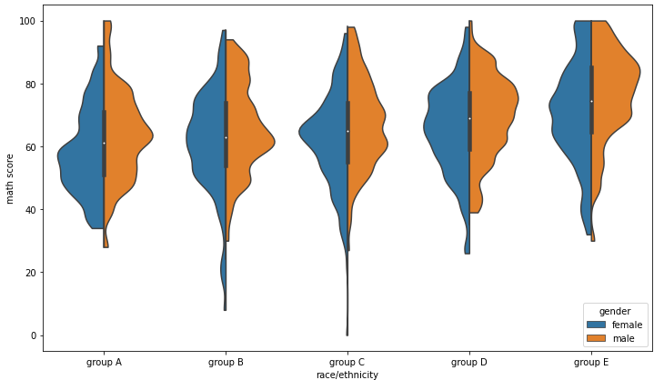
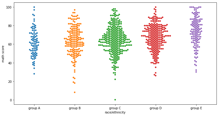
2-3. ETC
fig, axes = plt.subplots(3,1, figsize=(12, 21))
sns.boxenplot(x='race/ethnicity', y='math score', data=student, ax=axes[0],
               order=sorted(student['race/ethnicity'].unique()))

sns.swarmplot(x='race/ethnicity', y='math score', data=student, ax=axes[1],
               order=sorted(student['race/ethnicity'].unique()))

sns.stripplot(x='race/ethnicity', y='math score', data=student, ax=axes[2],
               order=sorted(student['race/ethnicity'].unique()))
plt.show()

출처: 부스트캠프 AI Tech 4기(NAVER Connect Foundation)
'부스트캠프 AI Tech 4기' 카테고리의 다른 글
| (Data Viz) Seaborn 기초 실습 - 4 (Relational API, Regression API) (0) | 2023.06.28 |
|---|---|
| (Data Viz) Seaborn 기초 실습 - 3 (Distribution API) (0) | 2023.06.27 |
| (Data Viz) Seaborn 기초 실습 - 1 (0) | 2023.06.24 |
| (Data Viz) Seaborn 소개 (0) | 2023.06.24 |
| (NLP) Beam Search와 BLEU Score (0) | 2023.06.23 |


