부스트캠프 AI Tech 4기
(Data Viz) Text (+ 실습)
쉬엄쉬엄블로그
2023. 6. 13. 11:04
728x90
이 색깔은 주석이라 무시하셔도 됩니다.
Matplotlib에서 Text
Text in Viz
- 시각화에 Text?
- Visual representation들이 줄 수 없는 많은 설명을 추가해 줄 수 있음
- 잘못된 전달에서 생기는 오해를 방지할 수 있음
- 하지만 Text를 과하게 사용한다면 오히려 이해를 방해할 수도 있음
Anatomy of a Figure (Text ver.)
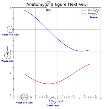
- Title : 가장 큰 주제를 설명
- Label : 축에 해당하는 데이터 정보를 제공
- Tick Label : 축에 눈금을 사용하여 스케일 정보를 추가
- Legend : 한 그래프에서 2개 이상의 서로 다른 데이터를 분류하기 위해서 사용하는 보조 정보
- Annotation(Text) : 그 외의 시각화에 대한 설명을 추가
!pip install matplotlib==3.3.2
import numpy as np
import pandas as pd
import matplotlib as mpl
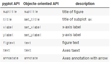
import matplotlib.pyplot as plt1. Text API in Matplotlib
fig, ax = plt.subplots()

fig.suptitle('Figure Title')

ax.plot([1, 3, 2], label='legend')
ax.legend()

ax.set_title('Ax Title')
ax.set_xlabel('X Label')
ax.set_ylabel('Y Label')

ax.text(x=1,y=2, s='Text')
fig.text(0.5, 0.6, s='Figure Text')

plt.show()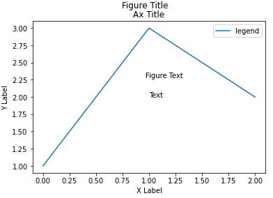
2. Text Properties
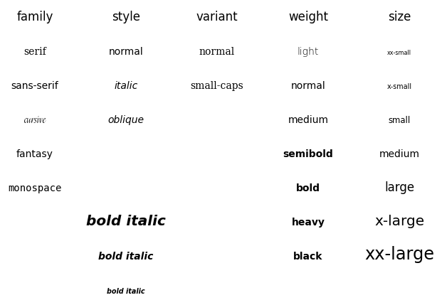
2-1. Font Components
가장 쉽게 바꿀 수 있는 요소들
- famliy
- size or fontsize
- style or fontstyle
- weight or fontweight
글씨체에 따른 가독성 관련 내용 참고
- Material Design : Understanding typography
- StackExchange : Is there any research with respect to how font-weight affects readability?
아래는 Fonts Demo
fig, ax = plt.subplots()
ax.set_xlim(0, 1)
ax.set_ylim(0, 1)

ax.text(x=0.5, y=0.5, s='Text\nis Important',
        fontsize=20,    # 'large'
        fontweight='bold',
        fontfamily='serif',
       )


plt.show()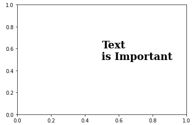
2-2. Details
폰트 자체와는 조금 다르지만 커스텀할 수 있는 요소들
- color
- linespacing
- backgroundcolor
- alpha
- zorder
- visible
fig, ax = plt.subplots()
ax.set_xlim(0, 1)
ax.set_ylim(0, 1)

ax.text(x=0.5, y=0.5, s='Text\nis Important',
        fontsize=20,
        fontweight='bold',
        fontfamily='serif',
        color='royalblue',
        linespacing=2,
        backgroundcolor='lightgray',
        alpha=0.5
       )


plt.show()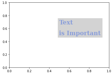
2-3. Alignment
정렬과 관련된 요소들
- ha : horizontal alignment
- va : vertical alignment
- rotation
- multialignment
fig, ax = plt.subplots()
ax.set_xlim(0, 1)
ax.set_ylim(0, 1)

ax.text(x=0.5, y=0.5, s='Text\nis Important',
        fontsize=20,
        fontweight='bold',
        fontfamily='serif',
        color='royalblue',
        linespacing=2,
        va='center', # top, bottom, center
        ha='center', # left, right, center
        rotation='horizontal' # vertical, 45
       )


plt.show()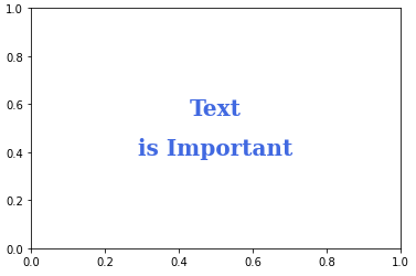
2-4. Advanced
- bbox
- Drawing fancy boxes
fig, ax = plt.subplots()
ax.set_xlim(0, 1)
ax.set_ylim(0, 1)

ax.text(x=0.5, y=0.5, s='Text\nis Important',
        fontsize=20,
        fontweight='bold',
        fontfamily='serif',
        color='black',
        linespacing=2,
        va='center', # top, bottom, center
        ha='center', # left, right, center
        rotation='horizontal', # vertical?
        bbox=dict(boxstyle='round', facecolor='wheat', ec='blue',
                  pad=3,
                  alpha=0.4,
                  )
       )


plt.show()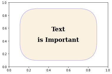
3. Text API 별 추가 사용법
student = pd.read_csv('./StudentsPerformance.csv')
student.head()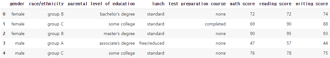
fig = plt.figure(figsize=(9, 9))
ax = fig.add_subplot(111, aspect=1)

for g, c in zip(['male', 'female'], ['royalblue', 'tomato']):
    student_sub = student[student['gender']==g]
    ax.scatter(x=student_sub ['math score'], y=student_sub ['reading score'],
               c=c,
               alpha=0.5,
               label=g)

ax.set_xlim(-3, 102)
ax.set_ylim(-3, 102)

ax.spines['top'].set_visible(False)
ax.spines['right'].set_visible(False)

ax.set_xlabel('Math Score')
ax.set_ylabel('Reading Score')

ax.set_title('Score Relation')
ax.legend()

plt.show()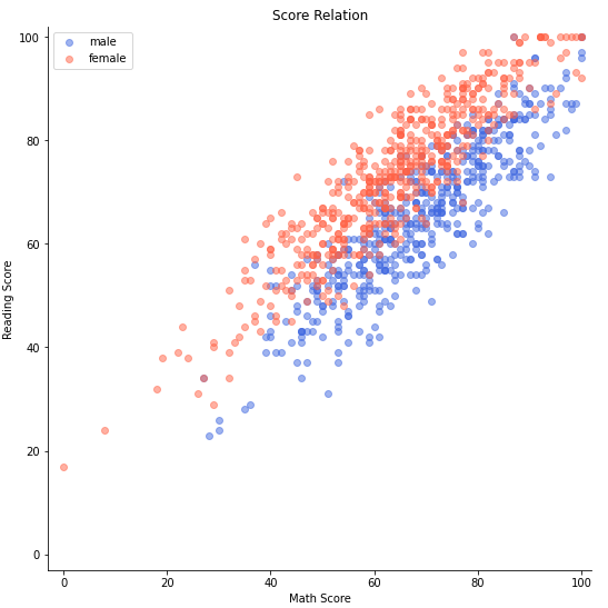
3-1 Title & Legend
- 제목의 위치 조정하기
- 범례에 제목, 그림자 달기, 위치 조정하기
fig = plt.figure(figsize=(9, 9))
ax = fig.add_subplot(111, aspect=1)

for g, c in zip(['male', 'female'], ['royalblue', 'tomato']):
    student_sub = student[student['gender']==g]
    ax.scatter(x=student_sub ['math score'], y=student_sub ['reading score'],
               c=c,
               alpha=0.5,
               label=g)

ax.set_xlim(-3, 102)
ax.set_ylim(-3, 102)

ax.spines['top'].set_visible(False)
ax.spines['right'].set_visible(False)

ax.set_xlabel('Math Score',
              fontweight='semibold')
ax.set_ylabel('Reading Score',
              fontweight='semibold')

ax.set_title('Score Relation',
             loc='left', va='bottom',
             fontweight='bold', fontsize=15
            )

ax.legend(
    title='Gender',
    shadow=True,
    labelspacing=1.2,
    # loc='lower right'
    bbox_to_anchor=[1.2, 0.5],
    ncol=2,
)

plt.show()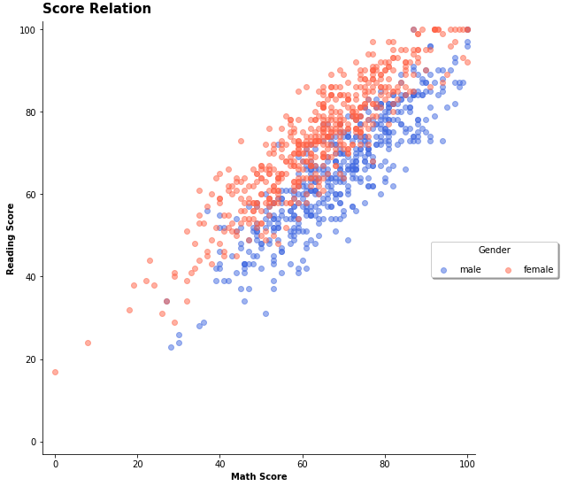
- bbox_to_anchor을 더 이해하고 싶다면 link 참고
3-2. Ticks & Text
- tick을 없애거나 조정하는 방법
- text의 alignment가 필요한 이유
def score_band(x):
    tmp = (x+9)//10
    if tmp <= 1:
        return '0 - 10'
    return f'{tmp*10-9} - {tmp*10}'

student['math-range'] = student['math score'].apply(score_band)
student['math-range'].value_counts().sort_index()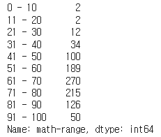
math_grade = student['math-range'].value_counts().sort_index()

fig, ax = plt.subplots(1, 1, figsize=(11, 7))
ax.bar(math_grade.index, math_grade,
       width=0.65,
       color='royalblue',
       linewidth=1,
       edgecolor='black'
      )

ax.margins(0.07)
plt.show()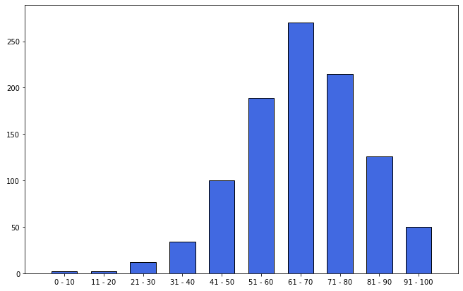
math_grade = student['math-range'].value_counts().sort_index()

fig, ax = plt.subplots(1, 1, figsize=(11, 7))
ax.bar(math_grade.index, math_grade,
       width=0.65,
       color='royalblue',
       linewidth=1,
       edgecolor='black'
      )

ax.margins(0.01, 0.1)
ax.set(frame_on=False)
ax.set_yticks([])	# y축 눈금 없애기
ax.set_xticks(np.arange(len(math_grade)))
ax.set_xticklabels(math_grade.index)

ax.set_title('Math Score Distribution', fontsize=14, fontweight='semibold')

for idx, val in math_grade.iteritems():
    ax.text(x=idx, y=val+3, s=val,
            va='bottom', ha='center',
            fontsize=11, fontweight='semibold'
           )

plt.show()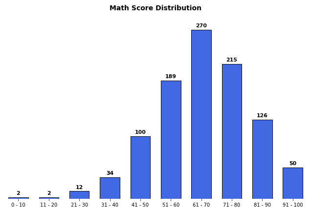
3-3. Annotate
- 화살표 사용하기
fig = plt.figure(figsize=(9, 9))
ax = fig.add_subplot(111, aspect=1)

i = 13

ax.scatter(x=student['math score'], y=student['reading score'],
           c='lightgray',
           alpha=0.9, zorder=5)

ax.scatter(x=student['math score'][i], y=student['reading score'][i],
           c='tomato',
           alpha=1, zorder=10)

ax.set_xlim(-3, 102)
ax.set_ylim(-3, 102)

ax.spines['top'].set_visible(False)
ax.spines['right'].set_visible(False)

ax.set_xlabel('Math Score')
ax.set_ylabel('Reading Score')

ax.set_title('Score Relation')

# x축과 평행한 선
ax.plot([-3, student['math score'][i]], [student['reading score'][i]]*2,
        color='gray', linestyle='--',
        zorder=8)

# y축과 평행한 선
ax.plot([student['math score'][i]]*2, [-3, student['reading score'][i]],
       color='gray', linestyle='--',
       zorder=8)

bbox = dict(boxstyle="round", fc='wheat', pad=0.2)
arrowprops = dict(
    arrowstyle="->")

ax.annotate(text=f'This is #{i} Studnet',
            xy=(student['math score'][i], student['reading score'][i]),
            xytext=[80, 40],
            bbox=bbox,
            arrowprops=arrowprops,
            zorder=9
           )

plt.show()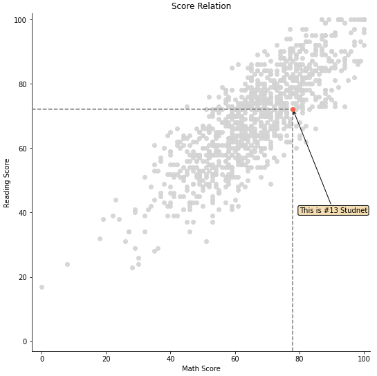
출처: 부스트캠프 AI Tech 4기(NAVER Connect Foundation)